Overview
Minty is a commerce platform that helps users discover cashback offers, savings opportunities, and partner retailers through a unified shopping experience. The project involved designing key user journeys across the customer lifecycle, including product discovery, store exploration, partner directories, and customer support experiences. The objective was to create a scalable and intuitive platform that makes it easy for users to understand the product value, discover participating merchants, and engage with the platform across desktop, tablet, and mobile devices.
Problem
During the initial analysis, several usability concerns became apparent:
- Weak visual hierarchy: important content competed for attention equally, making scanning difficult.
- Information overload: too many elements were introduced too early, increasing cognitive load.
- Unclear CTA prioritization: primary actions lacked enough contrast and emphasis.
- Fragmented content flow: sections did not guide users naturally through the page journey.
Also Users needed to:
- Discover cashback opportunities efficiently.
- Browse hundreds of partner stores.
- Locate specific merchants easily.
- Contact support or partnership teams when needed.
Goal
The primary objectives were to improve homepage scannability, create clearer user pathways, reduce cognitive friction, improve CTA visibility, build a modern structured layout, and create stronger visual consistency across sections.
Research & Discovery
Before beginning the redesign, I analyzed modern SaaS and product landing pages, common homepage UX patterns, and user attention behavior during first-time visits.To understand how users would interact with the platform, I evaluated the experience through usability and information architecture principles. Several opportunities emerged:
- HomePage Discovery: Users visiting for the first time needed immediate clarity regarding:
- What Minty is
- How it works
- Why they should join
- Store Exploration: Users required efficient methods to browse and compare stores without becoming overwhelmed by large amounts of information.
- Directory Navigation: The platform contained a growing number of partner merchants, requiring a scalable approach to content organization and discoverability.
- Support & Partnerships: The contact experience needed to accommodate both customers seeking assistance and businesses interested in partnerships.
Design Process
Information Architecture
I reorganized the homepage based on user intent, business importance, and decision-making priority. I organized content into clearly defined user journeys to reduce cognitive load and improve discoverability. The platform structure focused on:
- Product Education
- Store Discovery
- Store Navigation
- Support & Partnerships
Responsive Design Strategy
A mobile-first responsive framework was applied to ensure consistency across:
- Desktop
- Mobile
- Tablet
Component-Based Design
Reusable design patterns were developed to create consistency across the platform.
- Navigation components
- Store cards
- Call-to-action buttons
- Form elements
- Directory filters
This approach improved scalability and maintained a cohesive visual language.
Key Design Decisions
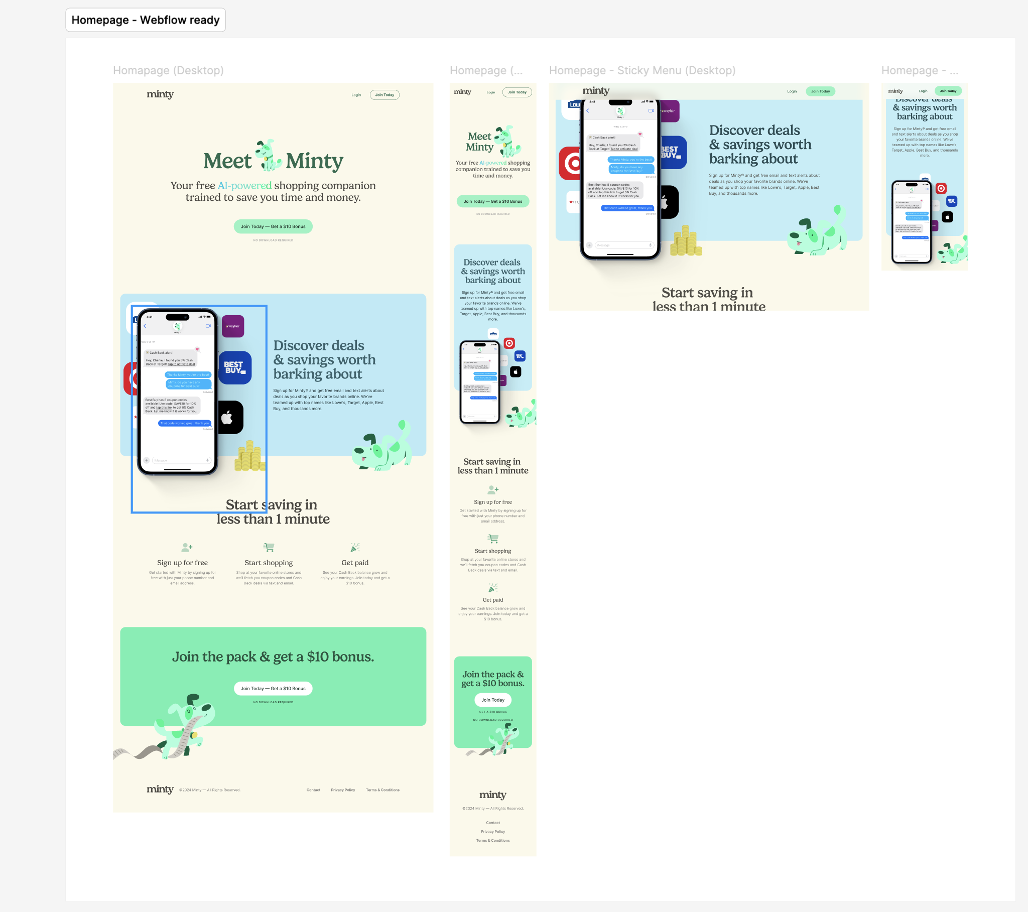
Homepage Experience
Visual Hierarchy
The homepage was designed to communicate value within the first few seconds of interaction.
Large headings, supporting content, and prominent calls-to-action establish a clear reading path and guide users toward engagement.
Progressive Disclosure
Information is introduced gradually rather than overwhelming users with details upfront.
This helps users understand the platform step-by-step.
Consistent Spacing System
Created visual rhythm and improved scanning.
Product Demonstration
Interactive product visuals and familiar retail brands provide immediate context and build trust.
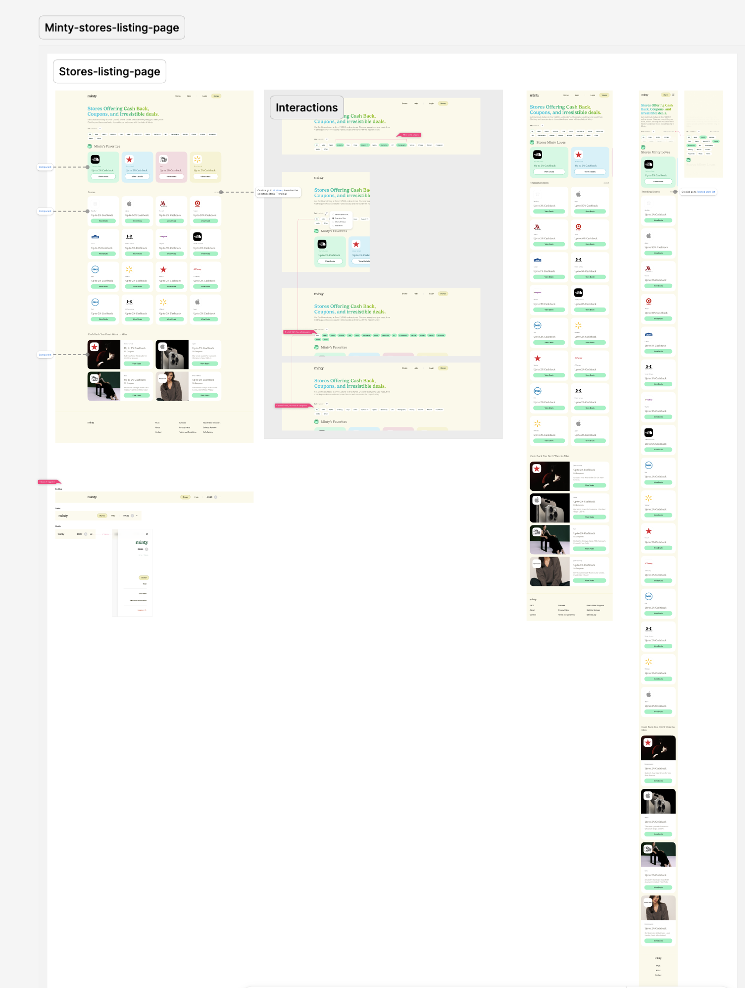
Store Discovery Experience
Card-Based Architecture
Partner stores are presented using reusable cards that surface key information consistently.
This allows users to quickly compare offers and navigate efficiently.
Personalization
Favorite stores are surfaced prominently to reduce effort for returning users and improve task efficiency.
Visual Consistency
A standardized card structure supports rapid scanning and easier decision-making.
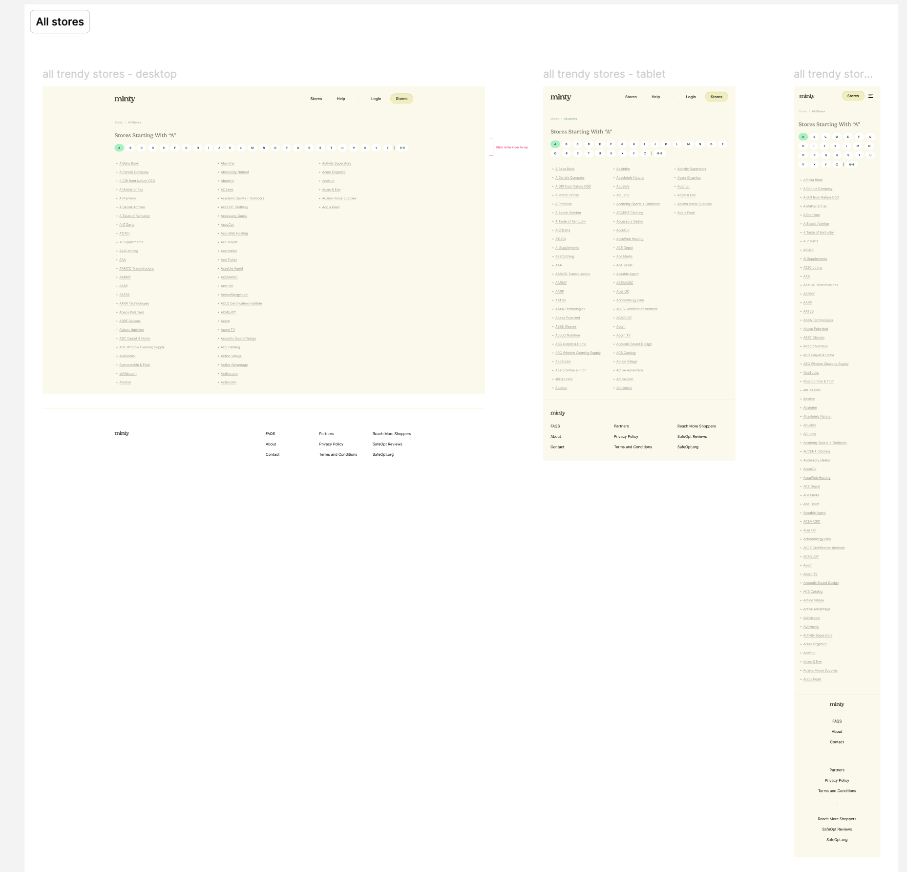
All Stores Directory
Scalable Navigation
Alphabetical filtering was introduced to support navigation across a large dataset of merchants.
This creates a predictable mental model and improves findability.
Cognitive Load Reduction
Breaking hundreds of stores into manageable categories helps users locate information more efficiently.
Wayfinding
Persistent navigation elements help users maintain awareness of their location within the directory.
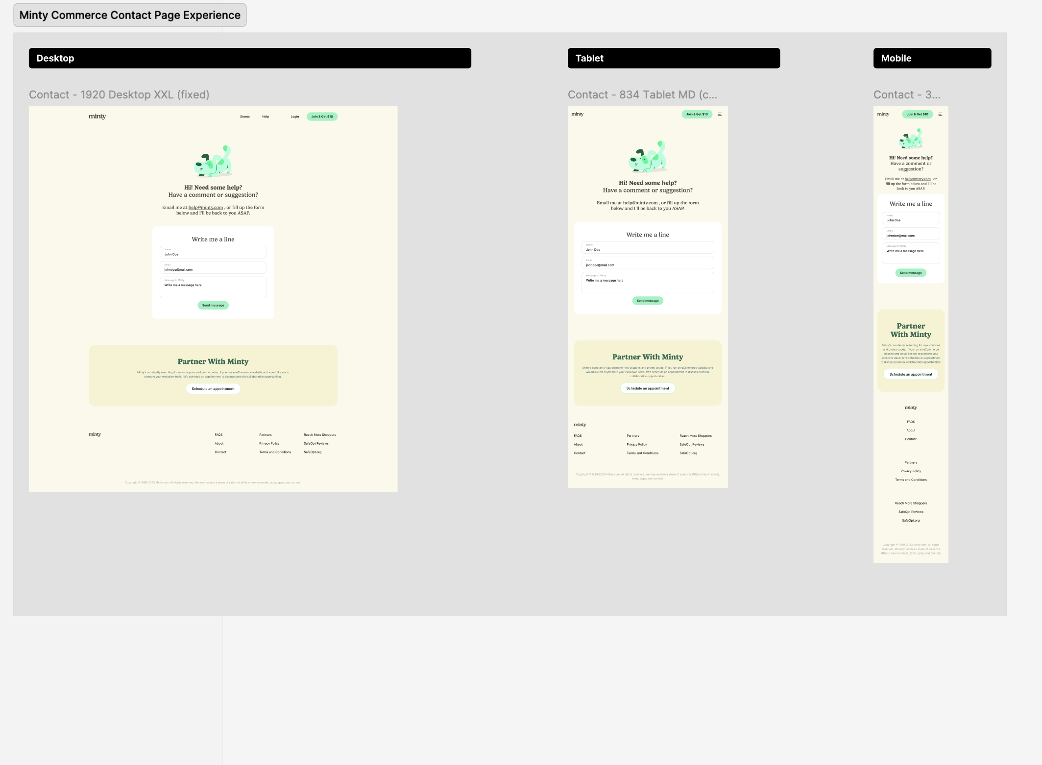
Contact & Partnership Experience
Form Simplification
Only essential fields were included to reduce friction and improve completion rates.
Audience Segmentation
The page supports two distinct user groups:
- Customers seeking assistance
- Businesses exploring partnerships
Visual separation between these pathways helps users quickly identify the appropriate next step.
Accessibility Considerations
Clear field labels, spacing, and hierarchy improve usability across devices.
Outcome
- Optimized content-centric user experiences and information architecture, reducing user navigation effort by 20% across key e-commerce workflows.
- Established 25+ UX content standards, interface guidelines, and interaction patterns — reducing design inconsistencies across multiple product streams.
- Contributed 30+ reusable components and content patterns to the enterprise design system, cutting duplicate design effort by 30% and improving consistency across products.
- Participated in 15+ product discovery workshops, journey mapping sessions, and stakeholder alignment meetings, helping define user requirements and product direction.
Built with: React · Next.js · TypeScript · SCSS · Figma · WordPress
Reflection
Minty taught me how much a first impression costs when it's unclear. The original experience gave users everything at once — and in doing so, communicated nothing. The most interesting design tension I navigated was between business goals (surface as many partner stores as possible) and user needs (don't overwhelm me on first visit). Progressive disclosure became less of a principle and more of a survival strategy. What I'd do differently: I'd want to run first-click tests on the homepage hero to validate whether users could identify the primary CTA without prompting. The hierarchy feels right, but assumption isn't validation. I'd also explore whether the alphabetical directory filter is the right mental model — or whether users actually search by category or cashback percentage first.
UX Principles Applied
- Information Architecture
- Visual Hierarchy
- Progressive Disclosure
- Cognitive Load Reduction
- Responsive Design
- Accessibility
- Gestalt Principles
- Recognition Over Recall
- Conversion-Centered Design
- Component-Based Design Systems